

Bodoni Poster
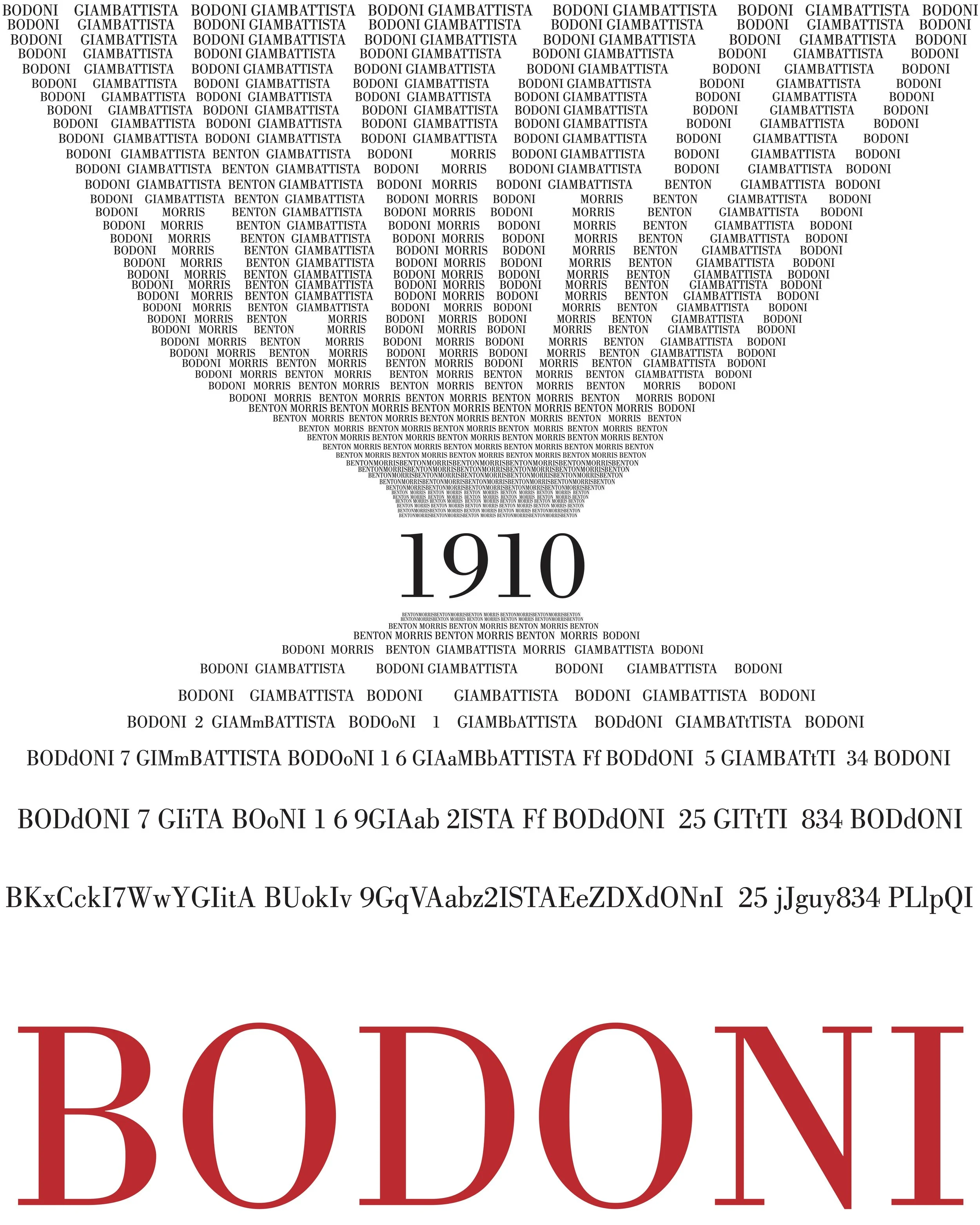
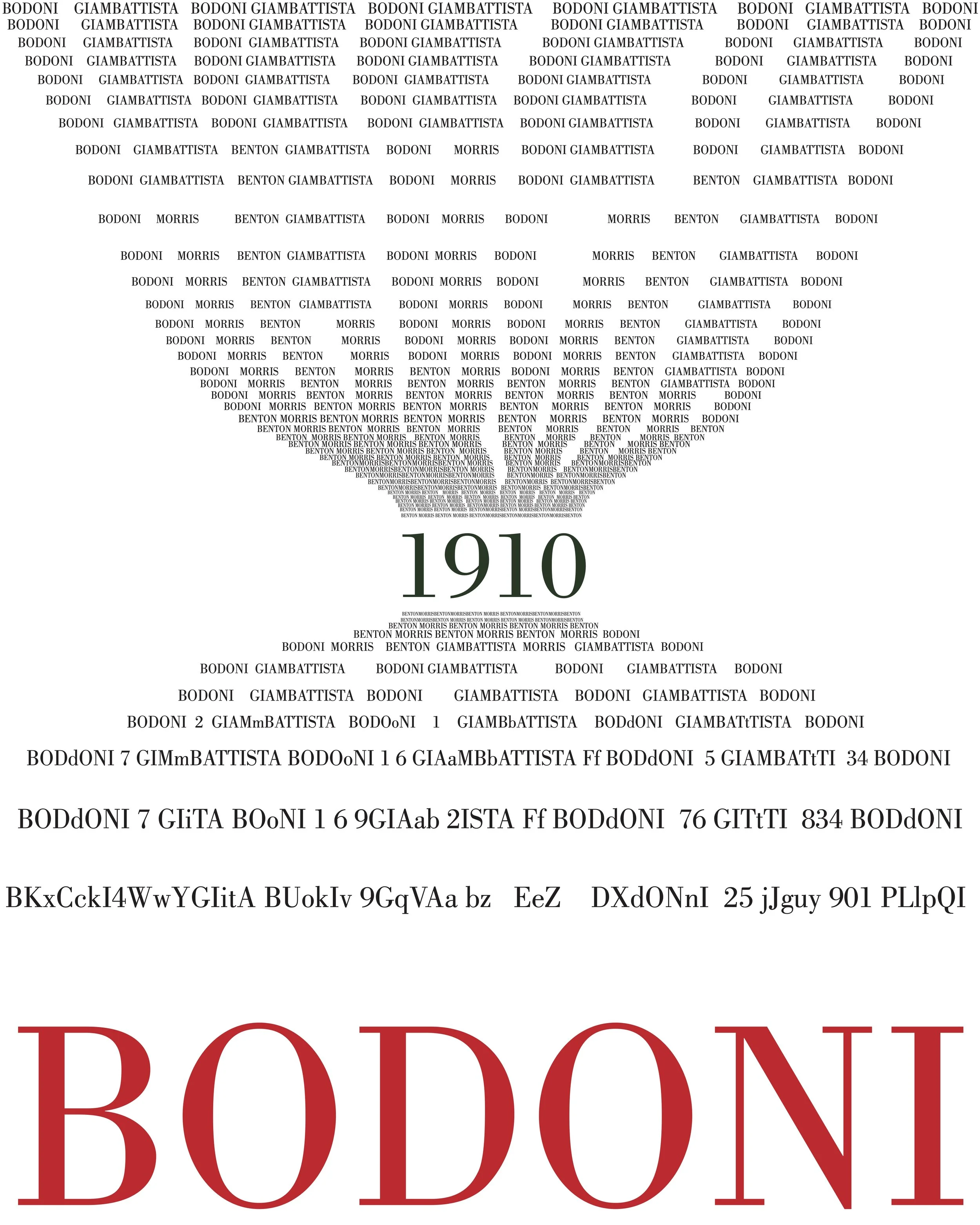
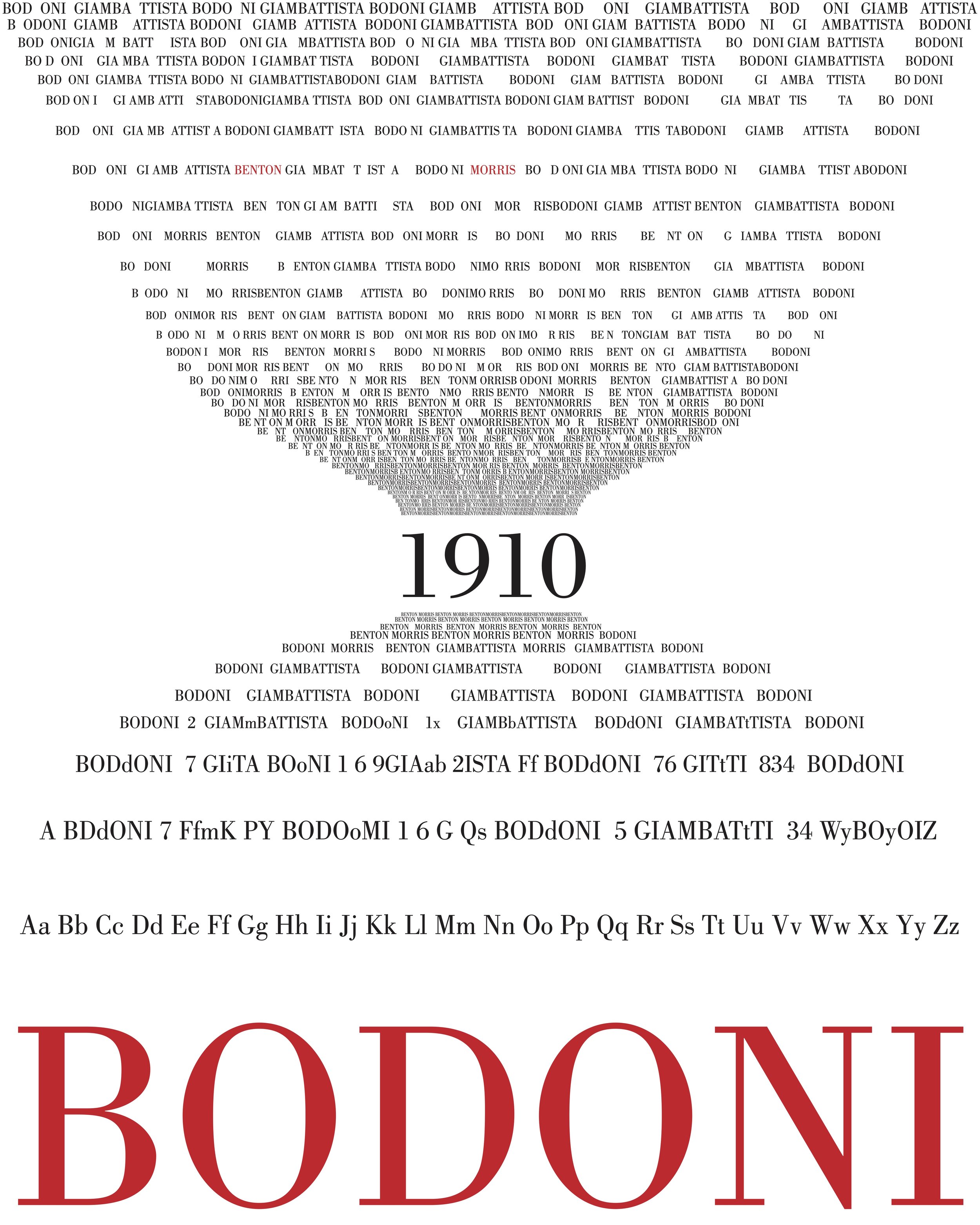
This poster is an homage to Giambattista Bodoni, who in the 1790’s created the typeface we now know as ‘Bodoni.’ Many interpretations of this typeface have since been produced by different type foundries.
For this poster, I used a 1910 font release designed by Morris Fuller Benton called ‘Bodoni Book Standard,’ which seemed the closest available adherence to the original, with modifications only intended to increase legibility. I shaped the type into an hourglass figure because I found fascination with the typeface’s longevity and its evolution throughout time. The poster moves chronologically from top to bottom; the clustering and size of the type on the poster reflects popular application of the typeface during that time, from body text to poster titling. As the size and clustering shifts, so do the names in the type to reflect Benton’s role in the continued usage and availability of the typeface. The entire alphabet as well as numbers 0-9 are included, so that viewers are exposed to the font’s entirety.
Interpretive ‘Bodoni’ fonts that have formed iconic and reproduced cultural images:
‘Poster Bodoni’ - Used on the posters for the movie adaptation of Mamma Mia.
‘Bodoni Poster-Compressed’ - Used for the band Nirvana. In other words, this font is on a lot of t-shirts.