

Draft 1
Draft 2
Draft 3
Draft 4

Draft 5 - Final
Bodoni Poster
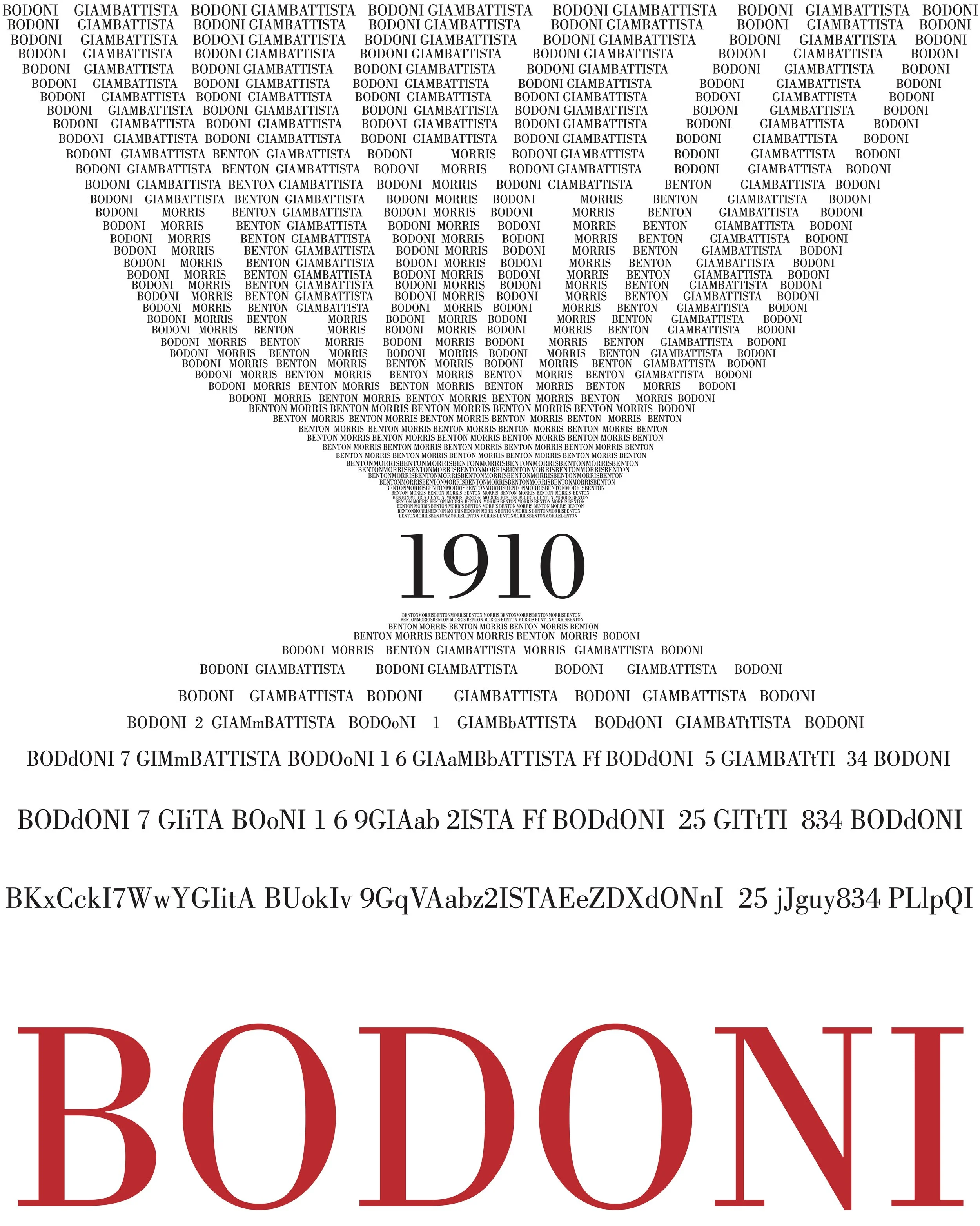
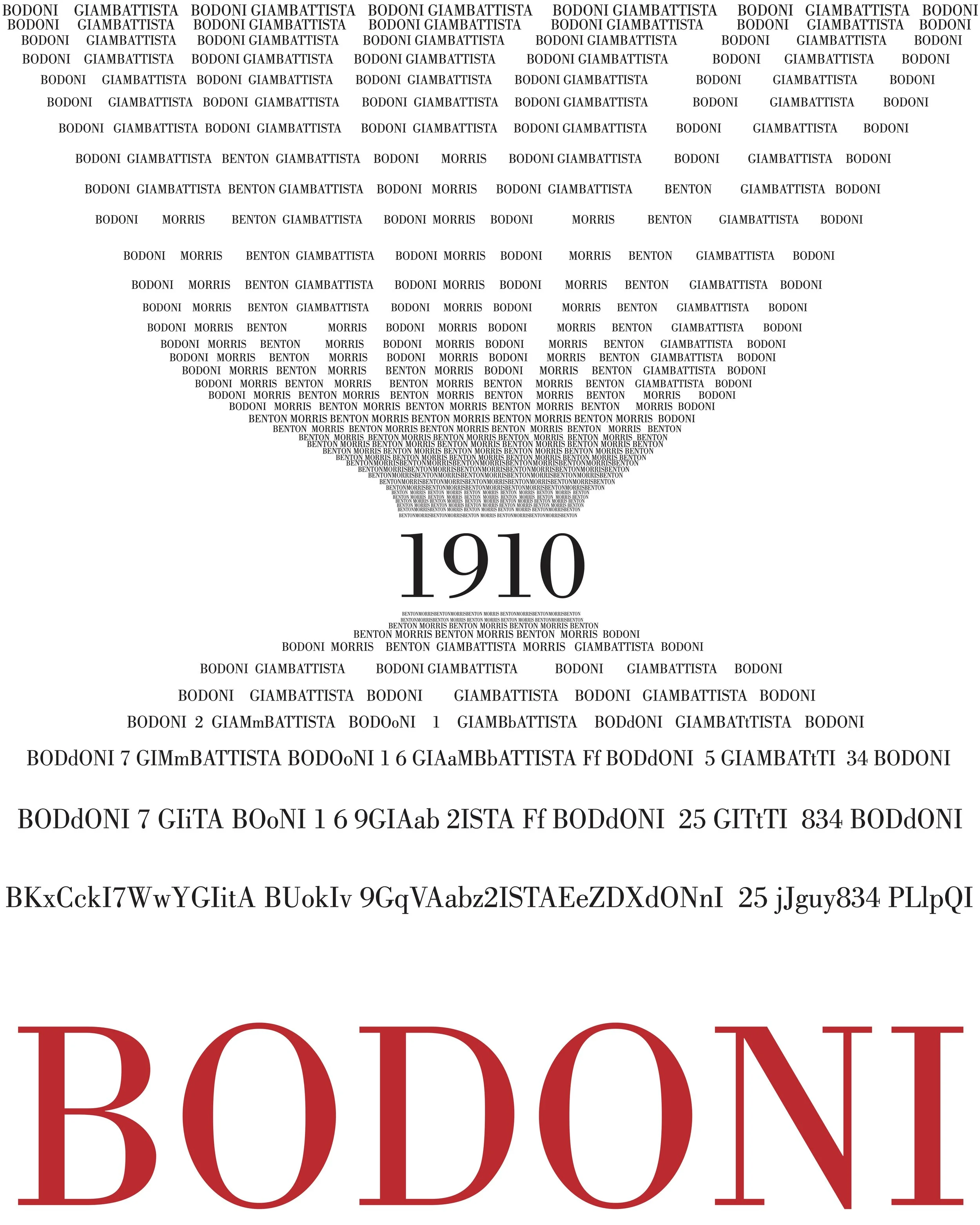
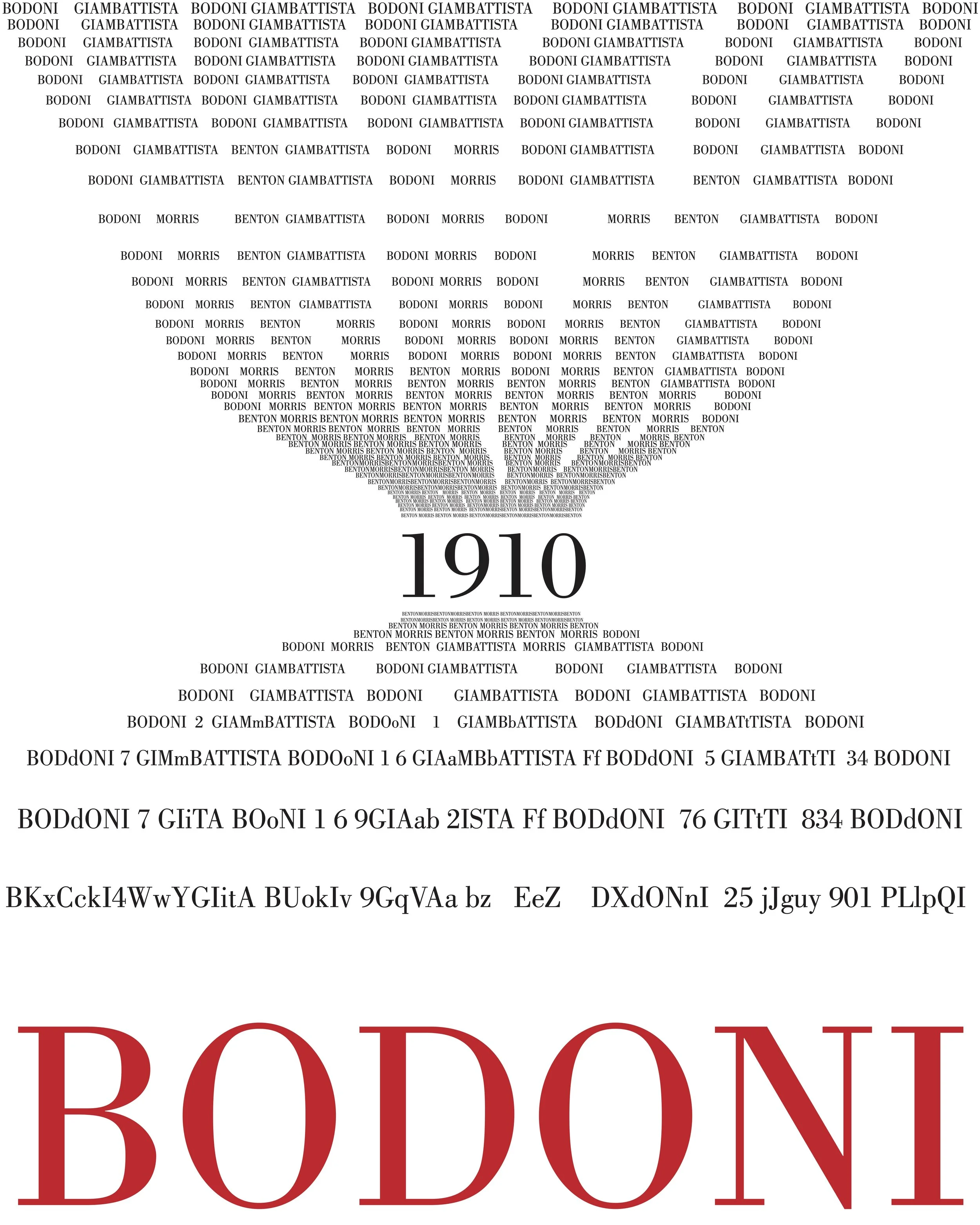
This poster is an homage to Giambattista Bodoni, who in the 1790’s created the typeface we now know as ‘Bodoni.’ Many interpretations of this typeface have since been produced by different type foundries.
For this poster, I used a 1910 font release designed by Morris Fuller Benton called ‘Bodoni Book Standard,’ which seemed the closest available adherence to the original, with modifications only intended to increase legibility. I shaped the type into an hourglass figure because I found fascination with the typeface’s longevity and its evolution throughout time. The poster moves chronologically from top to bottom; the clustering and size of the type on the poster reflects popular application of the typeface during that time, from body text to poster titling. As the size and clustering shifts, so do the names in the type to reflect Benton’s role in the continued usage and availability of the typeface. The entire alphabet as well as numbers 0-9 are included, so that viewers are exposed to the font’s entirety.
Interpretive ‘Bodoni’ fonts that have formed iconic and reproduced cultural images:
‘Poster Bodoni’ - Used on the posters for the movie adaptation of Mamma Mia.
‘Bodoni Poster-Compressed’ - Used for the band Nirvana. In other words, this font is on a lot of t-shirts.


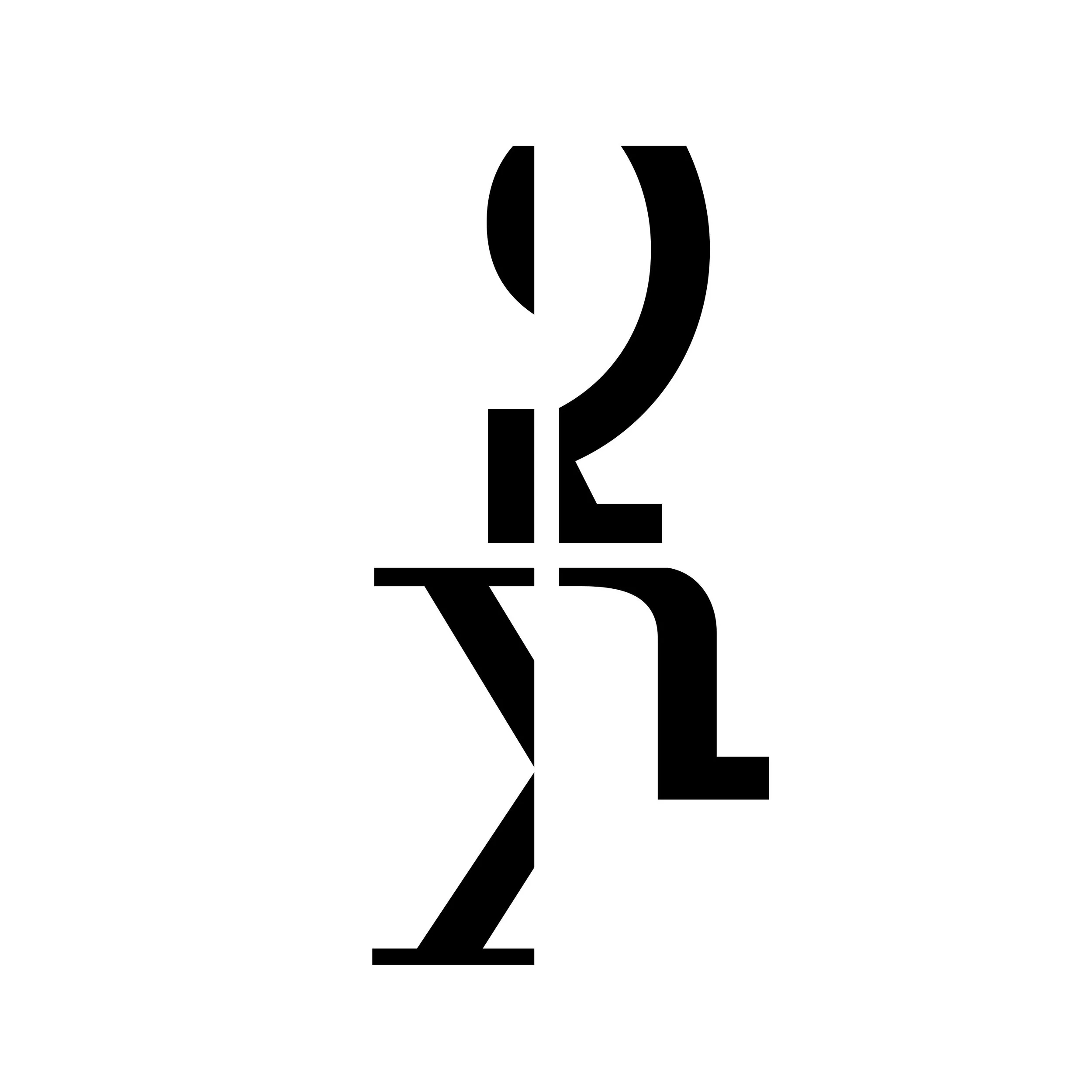
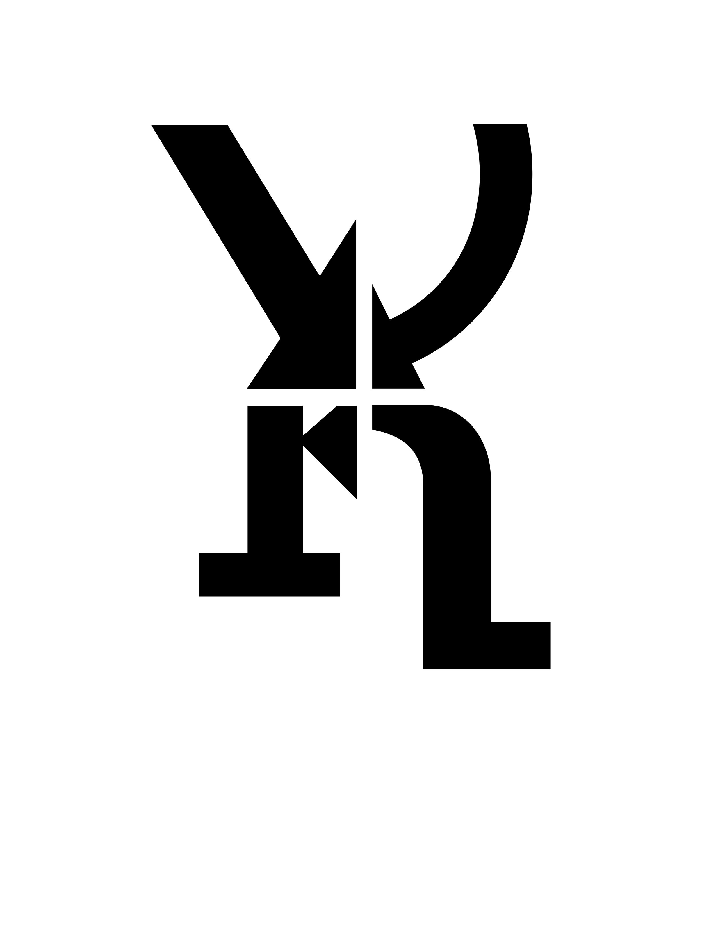
Letterforms
An exploration of the structural subtleties within the font ‘Memphis Light Standard Medium.’ In searching for compositional opportunities, I strived to push the boundary that is maintenance of a letter’s integrity. How closely cut or out of frame can a letter be before it becomes indiscernible? Furthermore, how can a letter be productive in its new crop and interact with its counterparts? The final product clockwise features: X, Q, R, and K. The arrows created by “X” and “Q” dynamically distract from any search for their original form. The “K” and “R” absorb the force from the top and together a diamond shape forms, while each letter remains distinguishable.

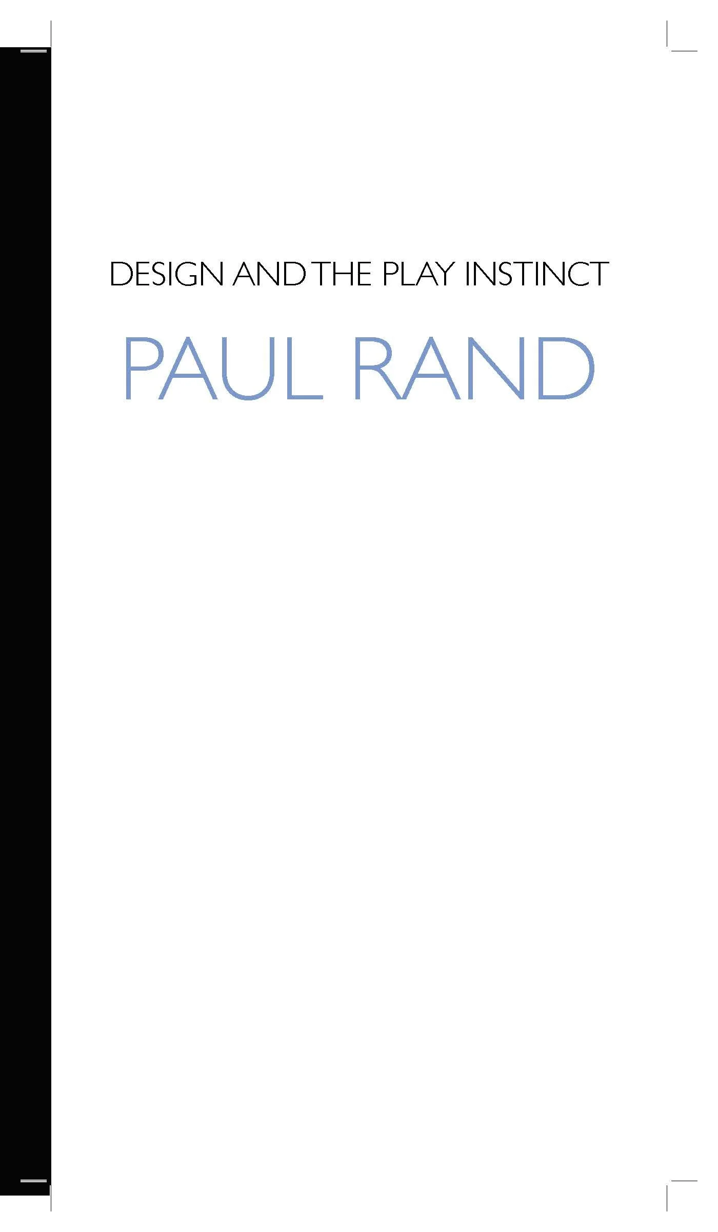

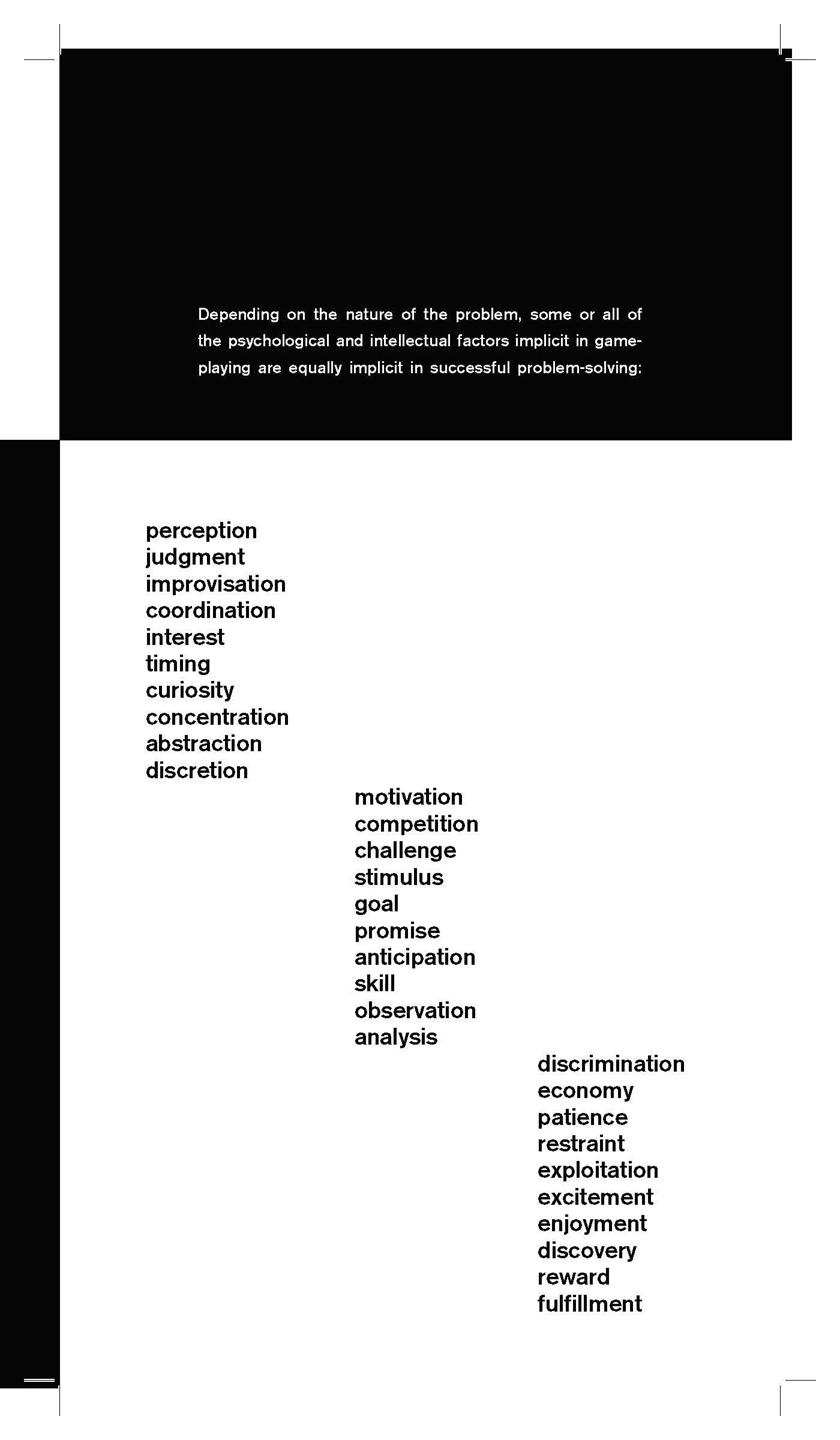
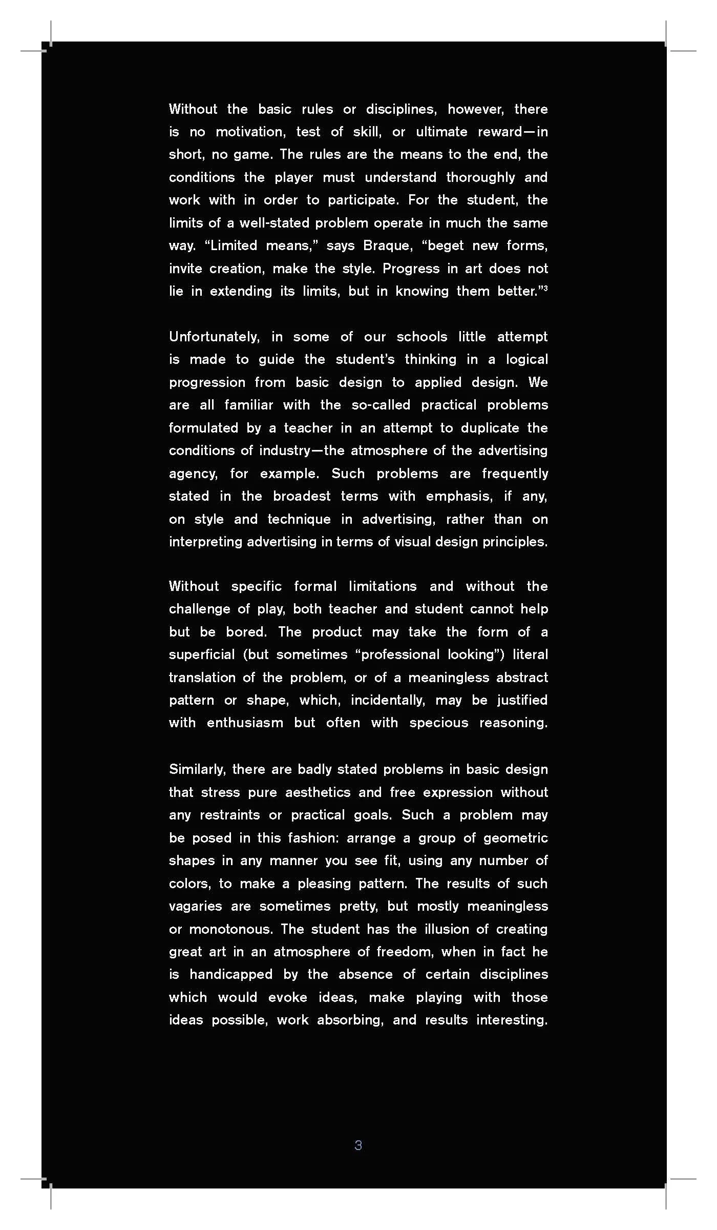


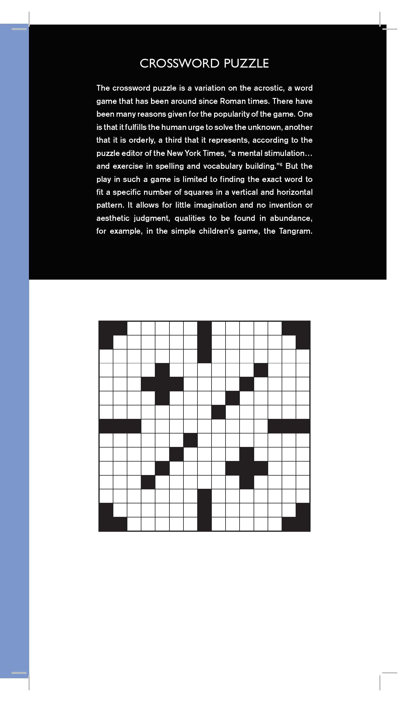
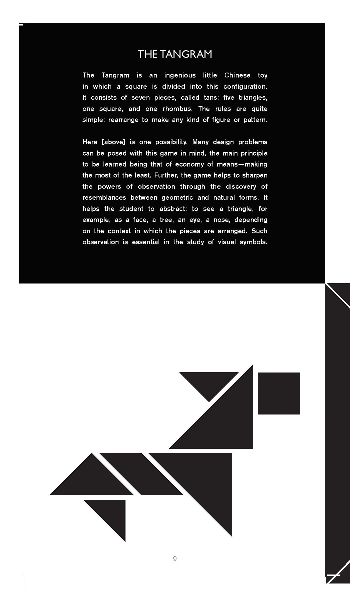

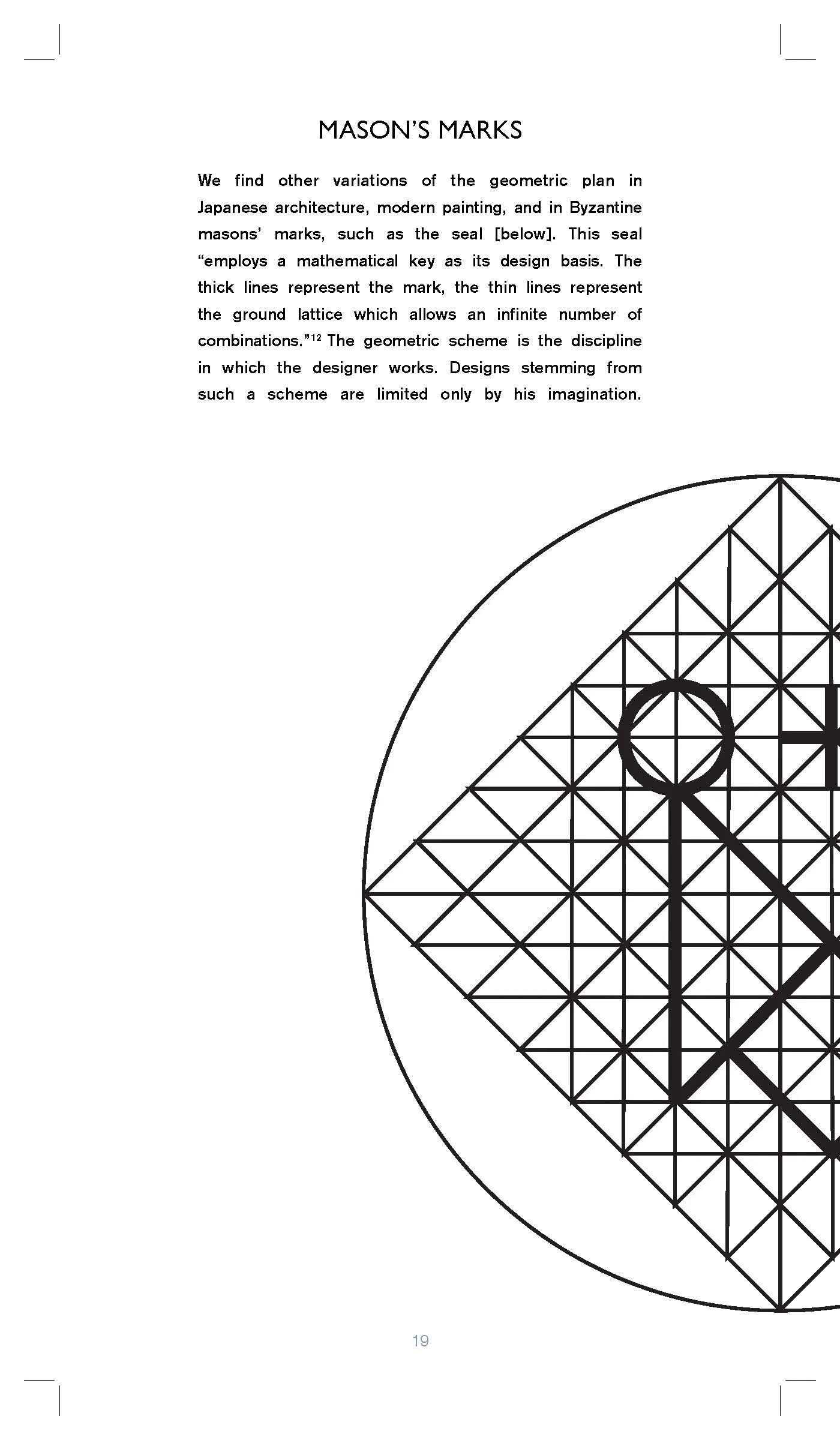
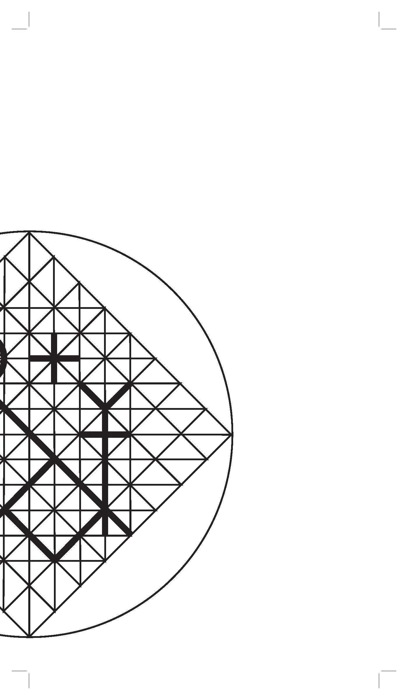
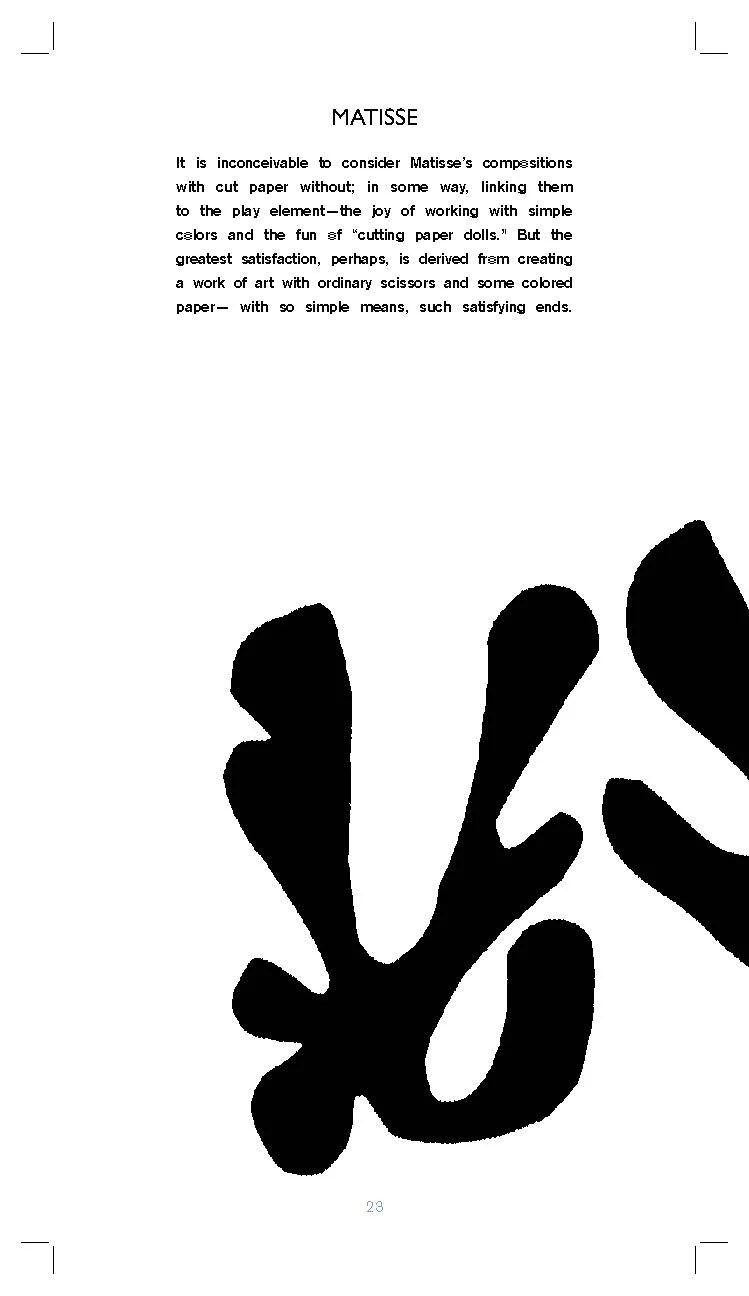
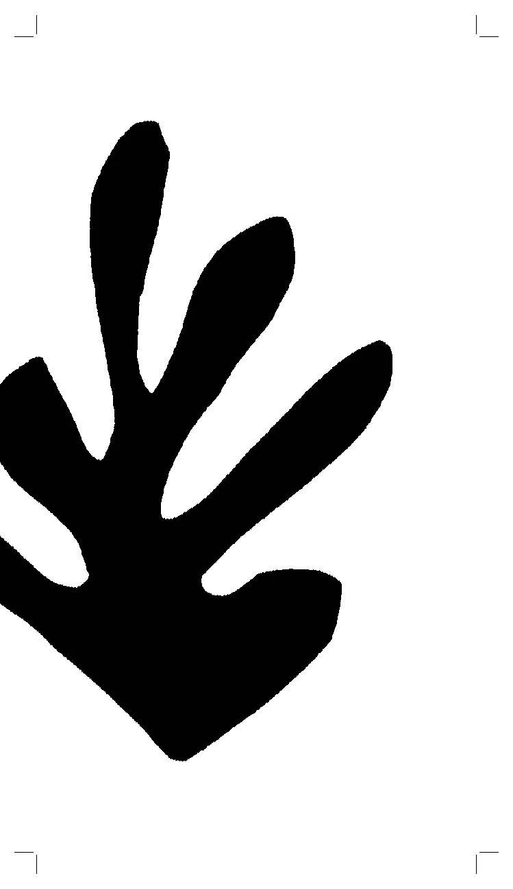
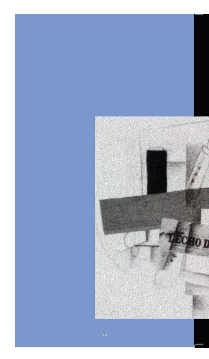
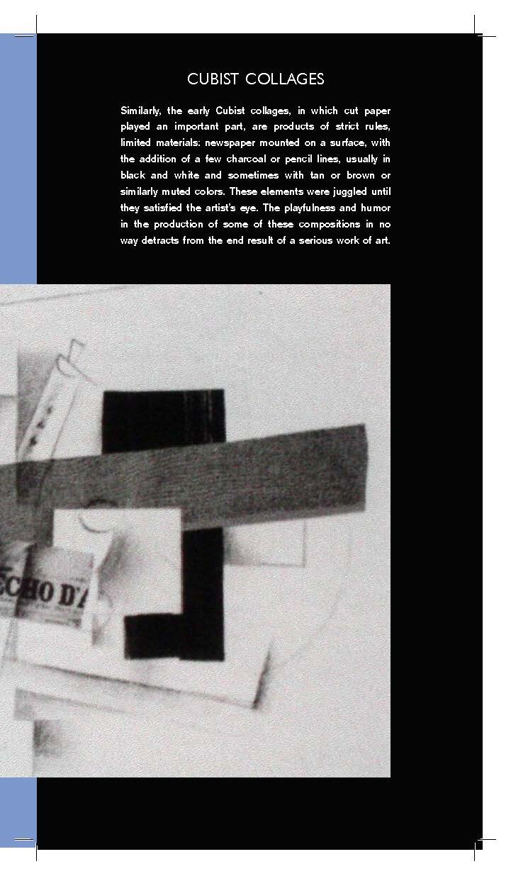
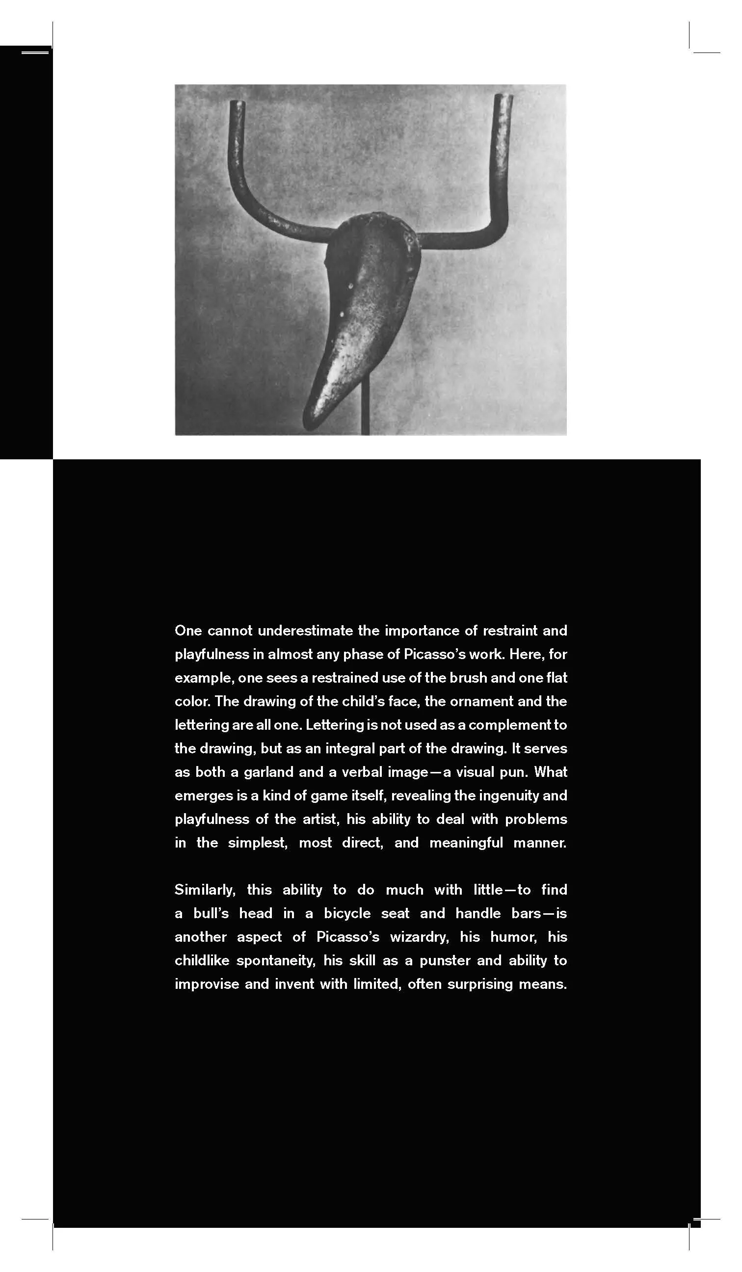

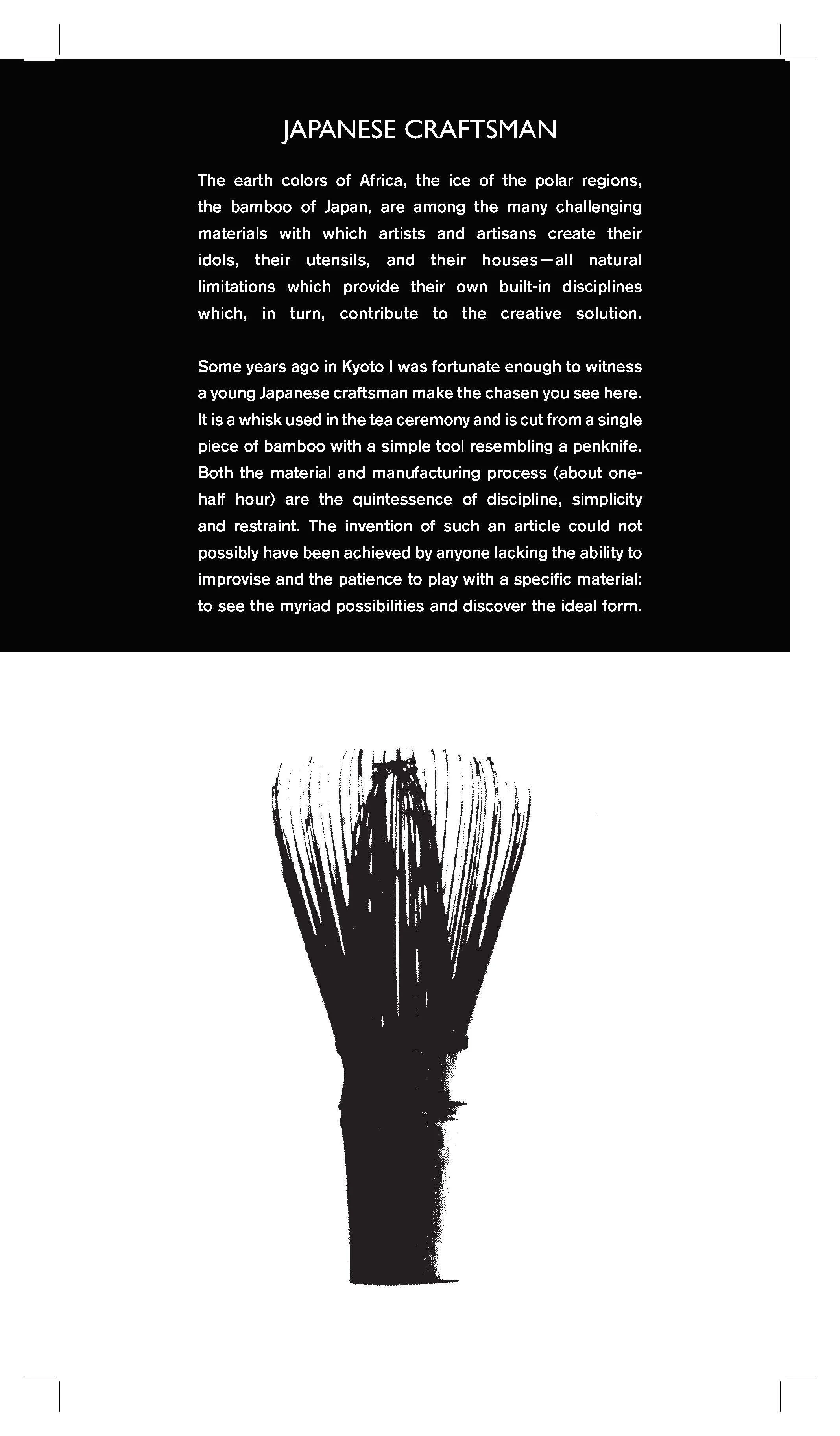

Design and the Play Instinct By Paul Rand
A redesign of Paul Rand’s Design and the Play Instinct, with use of the original text and imagery. My aim was to create a layout (using the grid system) that would encourage readers to sink into the text and use their imaginations. The white, black, and periwinkle blocked color scheme works to embolden without distraction. I felt that the design would be strongest as a supporting character to the content. Please excuse the overlap of the pages; they were made to be printed and bound.