
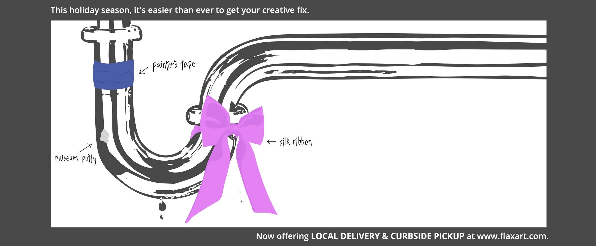
Holiday Ad
What’s a wrench when you have ribbon?
For the FLAX art & design Facebook holiday campaign. This ad was a stylistic divergence from the FLAX style guide. The motivation? Facebook’s interface can be entirely overwhelming; banner ads can easily get lost amongst other posts on your feed that you’re already—let’s be honest—likely not paying attention to. So, how do you make someone pause longer on an ad than on *gasp* so-and-so from high school did what? I aimed to create a composition that people wouldn’t habitually scroll past. For this reason, the Holiday Ad steers away from photograph and heavy text toward hand drawn, handwritten imagery. An organic pop within the technological landscape received higher engagement.
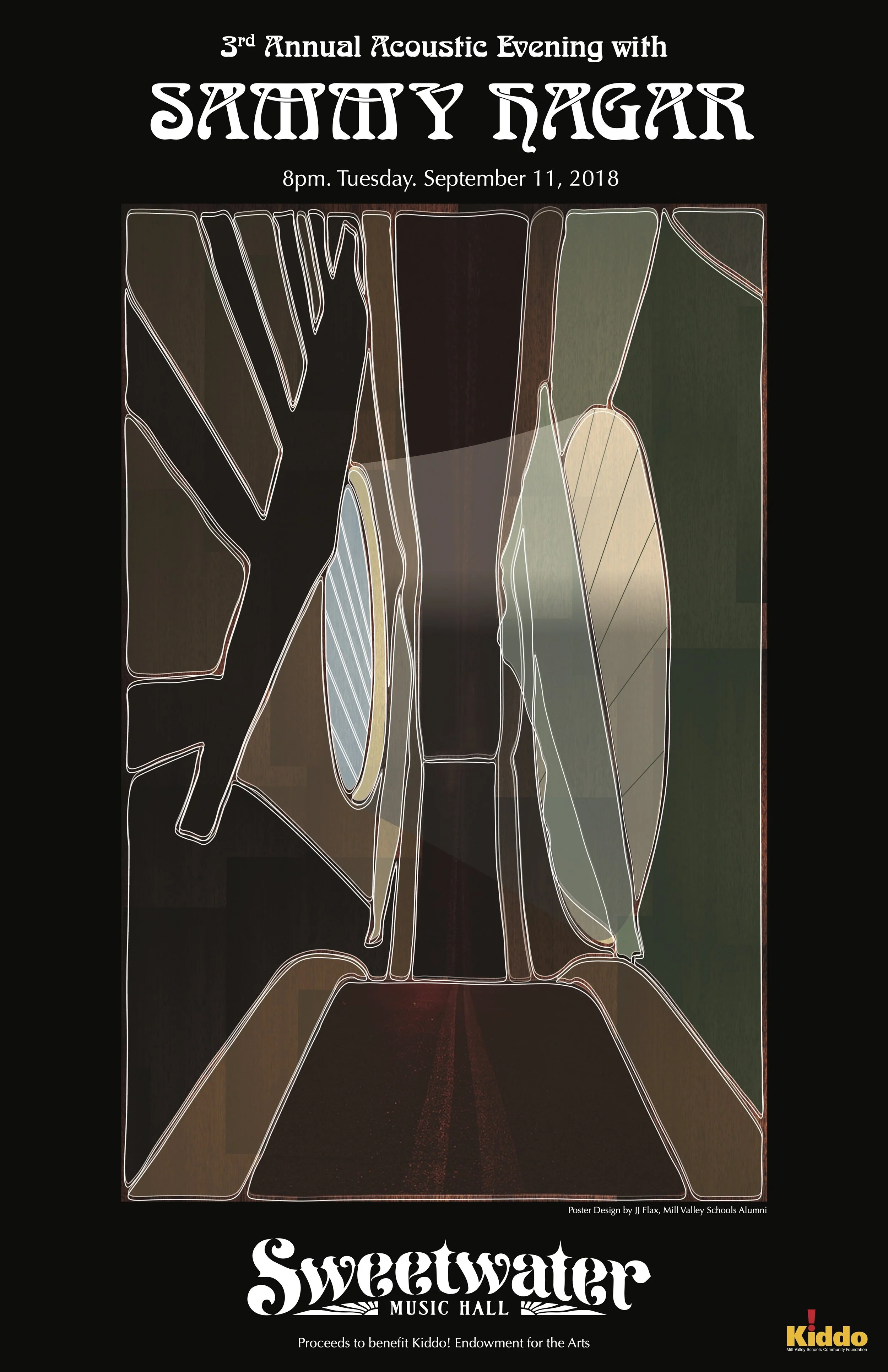
Sammy Hagar
For this poster, commissioned by Kiddo! Mill Valley Schools Community Foundation for a benefit concert of local importance, incorporating non-glaring regional motifs was a priority of mine. I chose to depict the inside of an acoustic guitar and illustrate geographic elements within, as if the community were inside the guitar. I stretched an image of the Bolinas-Fairfax Road to overlay the side of the guitar’s body, which runs vertically through the middle of the design. The sunlight flooding through the guitar’s center illuminates a “wooden” Mount Tamalpais and casts string shadows.


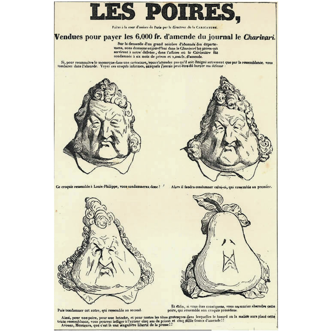
Controversial Leaders Become Fruit
The 1832 Les Poires caricatures by Charles Philipon were created to mock the then highly ridiculed, bourgeois monarch Louis-Philippe. Les Poires was impressively reproduced to cover walls all around Paris, cleverly navigating censorship law while also signifying a shift in design practice and principle with the advancement of visual literacy and communication.
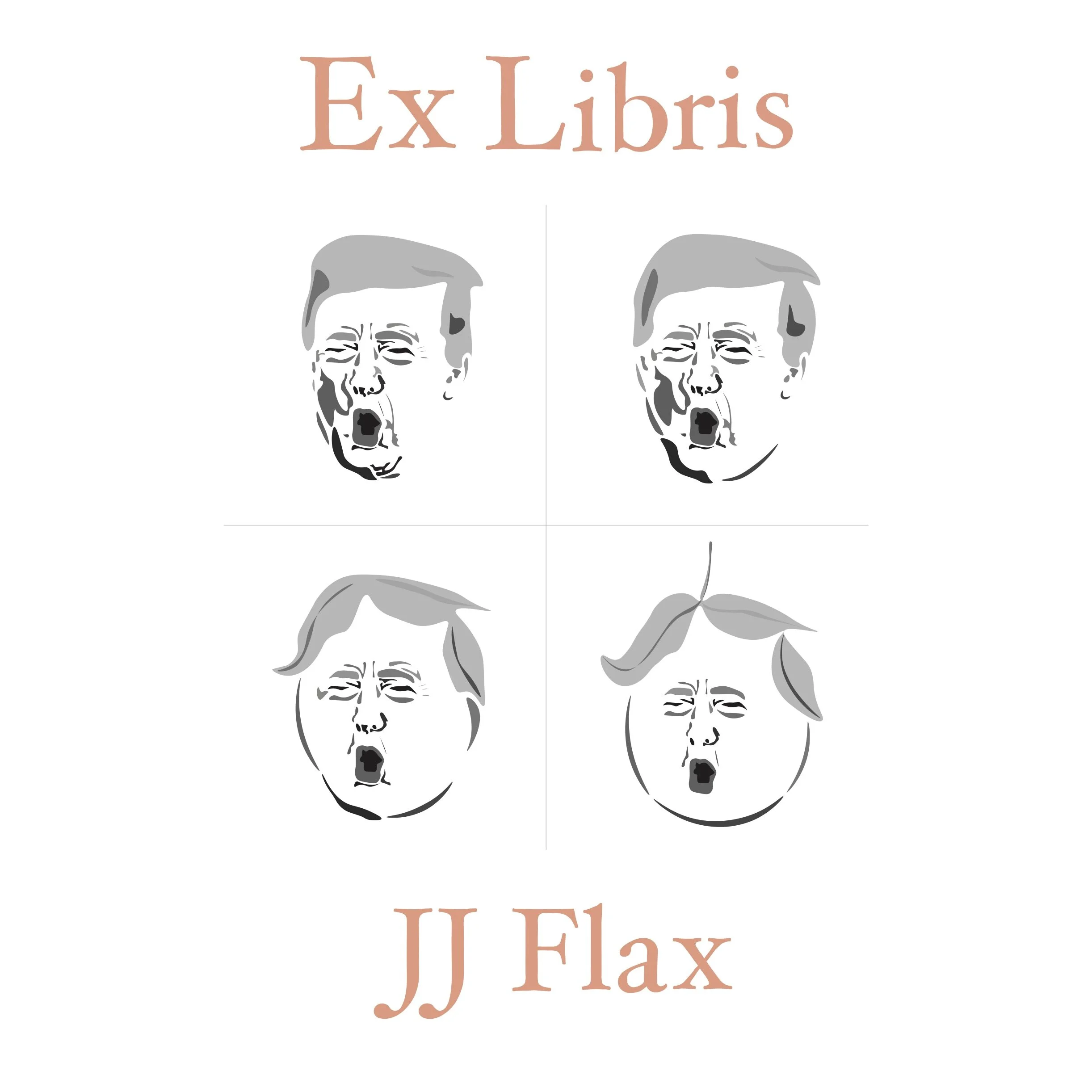
I was intrigued by the reproduction of Les Poires both as a form of graffiti and as a satirically innocent, but effective method of mockery. I adapted the work to replace Philippe with Trump, and the pear with a peach. Prior to viewing Philipon’s work, I had seen Trump compared to a peach in part due to his appearance, but also as a promotional tactic to impeach him. I chose to modify Les Poires because I am fascinated by the consistency of stylistic design concepts. I created my bookplate to appear stenciled, as if it were graffitied onto a wall with spray paint. The type I utilized is based on the small lettering found beneath Philipon’s caricatures; the lettering appears slightly messy in print execution, so I aimed to recreate that effect with slightly uneven strokes and alignment.